How to Choose Brand Colors That Actually Reflect Your Business
Choosing your brand colors isn't about picking whatever looks pretty on a moodboard. It's not even about choosing your personal favourite colour, however tempting that is. The colours you choose for your website are doing real work — communicating who you are, what you stand for, and why someone should trust you, often before they've read a single word.
Get it right and your colour palette becomes one of the most powerful, silent tools in your branding. Get it wrong and there's a quiet disconnect that visitors feel even if they can't quite explain why — like a brand that looks one way but sounds another, or a website that just doesn't feel like the business behind it.
Let's talk about how to actually choose brand colours strategically, not just instinctively.
Here's the most important thing to understand before you choose a single hex code: colour is never just decoration. It's communication.
Every colour carries psychological associations — built up over years of cultural conditioning, marketing, and shared human experience. Most people respond to colours in broadly similar ways, even if they couldn't articulate why. And that means the colours on your website are quietly shaping how people feel about your business before they've engaged with anything else.
A soft, muted palette feels different to a bold, saturated one. A combination of black and a single accent colour reads differently to a palette built from five different pastels. None of this is random — it's psychology, and it's worth understanding before you start choosing.
What different colours tend to communicate
This isn't an exact science, and colours can shift in meaning depending on shade, context, and combination. But broadly, here's how colour psychology in branding tends to play out.
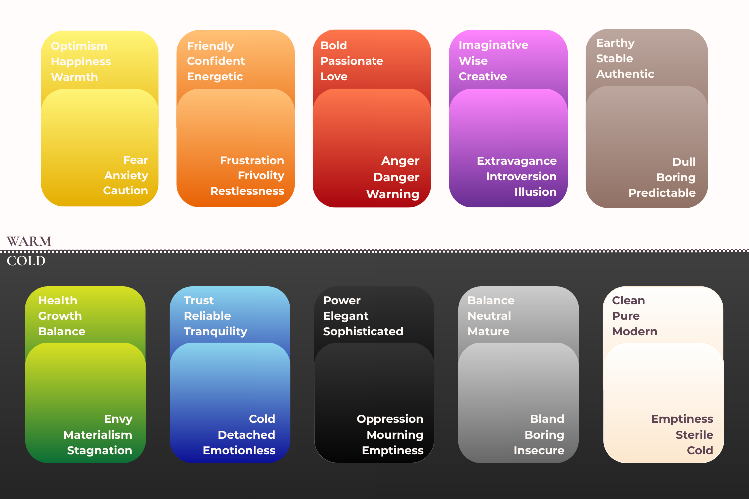
basic color chart
Yellow can feel warm, optimistic, and friendly — or, used carelessly, slightly anxious and attention-grabbing in the wrong way.
Orange tends to feel approachable and energetic, though it can tip into feeling unrefined if overused.
Red carries boldness, passion, and urgency — powerful when used intentionally, overwhelming when it isn't.
Purple is often associated with creativity, wisdom, and a sense of the premium or imaginative.
Brown reads as earthy, grounded, and authentic — a colour that's been having a genuine resurgence in elevated, natural branding.
Green signals growth, health, and calm — versatile and increasingly popular across wellness, sustainability, and lifestyle brands.
Blue is one of the most trusted colours in branding — strong, dependable, and professional, which is why it shows up so often in finance, law, and healthcare.
Black feels sophisticated, powerful, and authoritative — a colour that instantly elevates a brand when used with intention.
Grey is calm, balanced, and neutral — a brilliant supporting colour, though it can feel flat if it's doing too much of the work alone.
White feels clean, open, and premium — the foundation that lets everything else breathe.
The goal isn't to memorise this list and tick boxes. It's to understand that every colour choice you make is sending a signal — and the smartest brand palettes choose colours whose signals align with who you actually are.
Start with your brand personality, not your favourite colour
Before you choose a single colour, get clear on your brand's character. Not your logo, not your aesthetic preferences — your personality. How do you want people to feel when they land on your website? What three or four words describe the energy of your business?
Warm and reassuring? Bold and confident? Calm and grounded? Elegant and premium? Playful and approachable?
This matters because a colour palette has to support your brand's personality, not work against it. A wedding photographer specialising in soft, romantic, golden-hour imagery probably shouldn't be working with a harsh, high-contrast, neon palette — not because that palette is wrong in itself, but because it would feel disjointed against everything else she's communicating. The colours and the message need to tell the same story.
This is also why copying a colour palette you saw on someone else's website rarely works as well as you'd hope. Their colours were chosen — consciously or not — to support their brand personality. Yours needs to support your own.
Find your colour personality: the four seasons approach
If choosing a palette from scratch still feels overwhelming, here's a simpler way in. A popular approach in branding circles is to think of colour palettes in terms of four seasonal personalities — not literal seasons, but the emotional energy each one carries. It's a lovely shortcut for narrowing things down quickly.
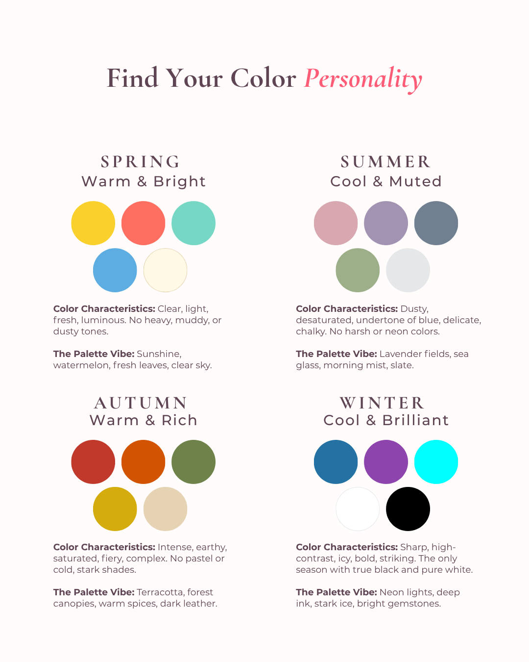
Seasonal color personality chart
🌸 Spring palettes are warm, fresh, and optimistic — think coral, peach, soft yellow, and bright grass green. This energy suits brands that are playful, approachable, and full of life. Think coaches, creatives, and businesses built around joy and possibility.
🌿 Summer palettes are soft, muted, and romantic — dusty rose, sage, lavender, warm grey. This is gentle, elegant, reassuring energy. It suits brands built on trust, softness, and emotional connection — think therapists, wellness practitioners, and service providers working closely with people.
🍂 Autumn palettes are warm, rich, and grounded — terracotta, mustard, deep olive, chocolate brown. This energy feels earthy, authentic, and established. It suits brands that want to feel experienced, dependable, and rooted in real expertise.
❄️ Winter palettes are bold, high-contrast, and clear — true black, crisp white, jewel tones like emerald or sapphire. This is confident, striking, premium energy. It suits brands that want to feel modern, sharp, and unmistakably in control.
None of these are rules — they're a starting point. If you read those four descriptions and one of them made you go "yes, that's me," that's worth paying attention to. It's often a faster route to a cohesive palette than starting from scratch with hundreds of hex codes in front of you.
And just like with any palette — once you've found your seasonal energy, the same principle applies. Pick one or two confident colours from that palette rather than trying to use all of them. Restraint is what makes a palette feel intentional rather than indecisive.
Let your photography lead the way
Here's a piece of advice that doesn't get talked about enough, and it's one of the simplest, most effective ways to build a website colour palette that feels genuinely cohesive — especially if you're a coach, consultant, or anyone whose website will feature plenty of photos of yourself.
If you're planning a brand photoshoot — whether with a professional photographer or simply a friend with a good camera and decent lighting — think about what you'll wear before you show up. Choosing one bold colour that genuinely suits you, and wearing it intentionally in some of your shots, gives you an instant highlight colour you can carry through your entire website. Use it for headlines, buttons, graphic accents, or bold section backgrounds.
This approach works beautifully because it keeps things simple. Black, a few shades of grey or neutral, and one confident accent colour is more than enough to create a polished, elevated look. You don't need five colours fighting for attention. One genuinely well-chosen accent colour against a clean neutral base creates something that feels deliberate and high-end — which, ultimately, is the goal.
If a full photoshoot isn't part of your plans right now, the same principle applies in reverse. Choose photography — whether of yourself, your work, or your space — that already has a consistent colour theme running through it. One or two repeating tones. If your existing photos are a bit scattered colour-wise, a simple retouch using a consistent preset can pull everything into line without you needing to reshoot a thing.
Your photography is not separate from your design — it is the design. The two need to work together, and starting with your imagery in mind makes choosing your colour palette dramatically simpler.
How to put your palette together
Once you've got a sense of your brand personality and, ideally, some photography to anchor things, building your actual palette becomes much more straightforward.
Start with a base. This is usually a neutral — black, white, a warm cream, or a soft charcoal. This will carry the bulk of your website: backgrounds, body text, structural elements.
Add one confident accent colour. This is your highlight — the colour that shows up in your buttons, your headlines, your standout sections. It should be the colour that most strongly reflects your brand's personality and, ideally, ties back to your photography.
Consider a secondary supporting colour if needed. Not every brand needs this, but a soft secondary tone can add depth without overcomplicating things — a muted rose alongside a dusty mauve, for example, or a warm beige alongside a deep forest green.
Resist the urge to add more. The brands that look the most expensive and the most considered are very rarely the ones with the biggest palette. Restraint reads as confidence. A cluttered, indecisive palette reads as exactly that — indecisive.
Building trust through colour consistency
One of the most underrated benefits of a well-chosen, well-applied colour palette is the trust it builds — quietly, consistently, every time someone interacts with your brand.
Brand colours that build trust are ones that show up the same way, every single time. The same blue on your website as on your Instagram. The same accent colour in your email graphics as in your proposal templates. That consistency does something powerful — it makes your brand feel established, intentional, and dependable, even to someone encountering you for the very first time.
Inconsistent colour use has the opposite effect. It creates a subtle sense that things aren't quite buttoned up — which, fairly or not, can translate into doubt about everything else.
Bringing it all together on your website
When your website's colour palette is built with this kind of intention, it does more than just look nice. It works alongside your copy, your photography, and your layout to tell one consistent, coherent story about who you are and what it's like to work with you.
That's the real goal of a website colour palette — not decoration for its own sake, but a visual language that supports everything else you're saying, before a single word is even read.
If you're sitting with a website where the colours feel like an afterthought, or a palette that was chosen quickly and never quite revisited, that might be one of the simplest, highest-impact things to fix.
At MSE Digital Designs, every website I build starts with this kind of intentional thinking — your brand personality, your photography, and a colour palette that genuinely supports both. The result is a site that doesn't just look good, it feels unmistakably like you.
Book your free discovery call and let's talk about what your brand colors should actually be saying.
Not sure if color is the only thing off?
If you've read this and you're realizing your colors aren't the only thing that might be working against you — that's exactly what the Website Audit is for.
For €197, you get a straight-talking audit of your website — what's working, what's costing you enquiries, and exactly what to fix first. Delivered as a branded PDF + personal Loom video walkthrough within 5 business days. No call needed.