Ever After Events
Wedding Planner Website Design
Mock Project

Project: Ever After Events – Wedding Planning Brand Identity
Concept: Editorial Romance & Grounded Warmth
Brand Season: Autumn (Authentic, Textured, Soulful)
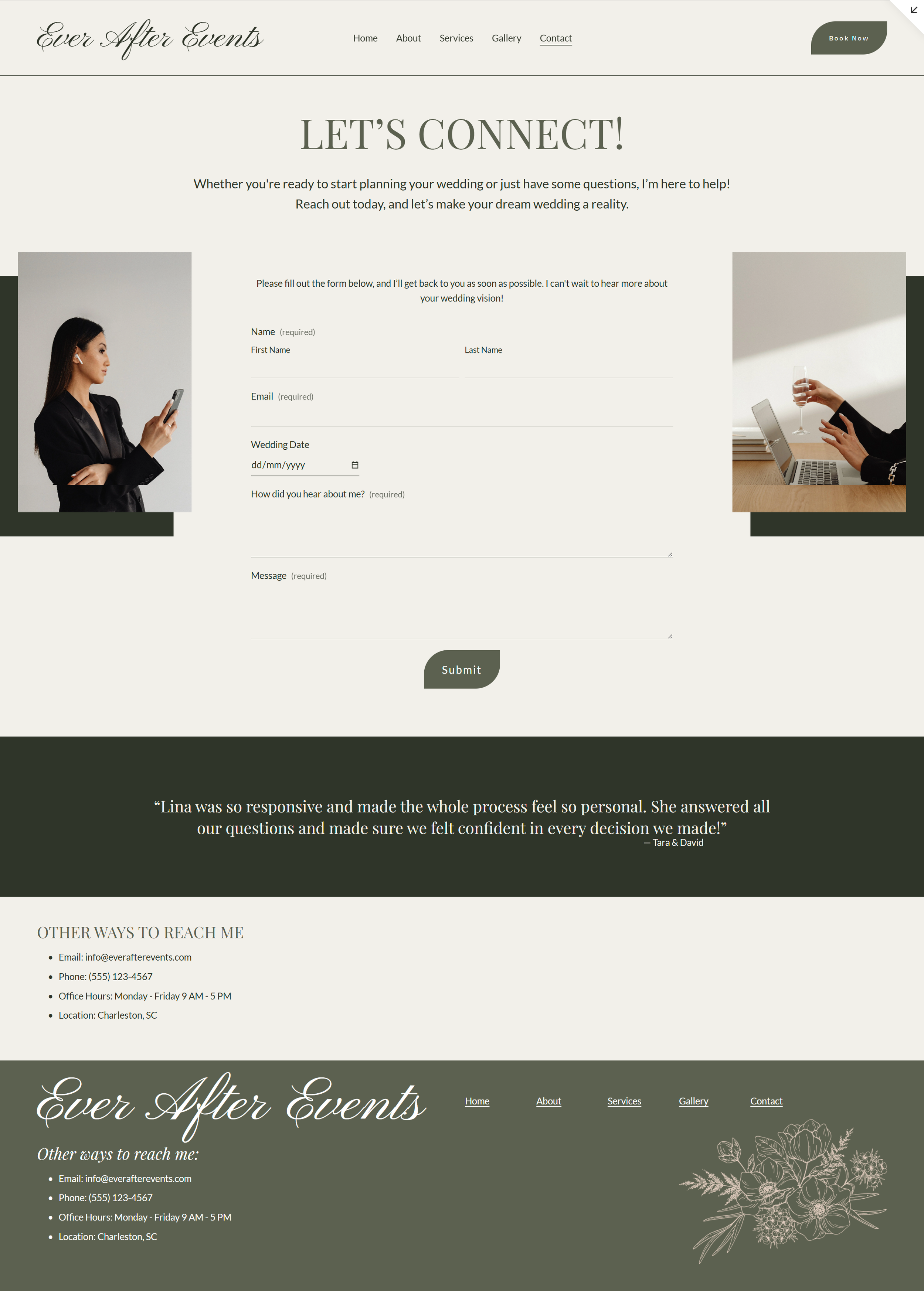
The Strategy: The goal was to move away from industry-standard stark whites and create a brand that feels established and "wildly in love." Using colour psychology, I developed a palette rooted in the Autumn personality. The foundation is a soft Alabaster (#F2F0EB) rather than white, adding immediate warmth and luxury.
The Visual Identity:
Palette:
Warm Taupe (
#C4B4A5) for primary section backgrounds to create depth.Deep Forest Charcoal (
#2F3529) is used for all text to ensure readability without the harshness of black.Sage Green (
#5C6150) serves as the strategic "Action Color," guiding users to buttons and key interactions.
Typography: I paired Playfair Display for high-contrast, editorial headlines with Lato for clean, structured body copy. Pinyon Script is used as an accent to inject a handwritten, personal touch.
Design
Home page
About page
Gallery page
Contact page
Services page
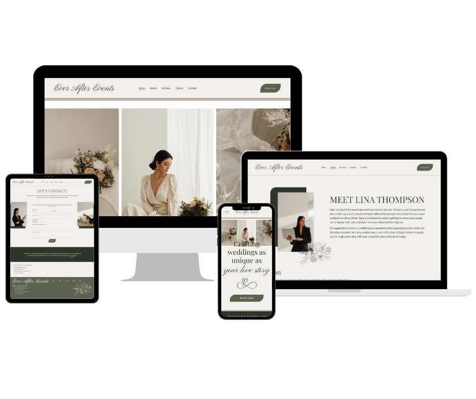
Responsive design
Want a custom website that feels like you?
Let’s create something beautiful together.