
Serengeti Spirit Adventure
Full redesign (on Wix) and mini-brand identity
“Emese is a total pro who explains all the tech stuff in 'plain English' so I finally understand my own website.”
"Emese is a total pro and honestly, a lifesaver. I thought I just needed a few 'touch-ups,' but she completely transformed my brand into something that actually looks as professional as my safaris feel.
The best part is that she explains all the tech stuff in 'plain English' so I finally understand my own website. I'm so happy with the result—if you need a Website Wingwoman who just gets it and gets it done, Emese is the one!"
— Andrea F.
Project Overview
Serengeti Spirit Adventure is a full redesign and mini-brand identity for Andrea, a professional safari tour guide. Originally brought in for minor "finishing touches," it became clear that the existing DIY site was not doing justice to the high-end adventure she provides. This project transformed a basic web presence into a professional, high-impact digital home that captures the authentic rhythm of the wild.
The Strategy
I moved the brand away from "DIY disaster" and toward a cohesive, earthy professional identity.
Truth-Telling: On the initial discovery call, I identified that minor tweaks wouldn't fix the underlying brand disconnect and pitched a full redesign instead.
Mini Brand Identity: I developed a brand new visual foundation, including a primary logo that feels established and authentic to Tanzania.
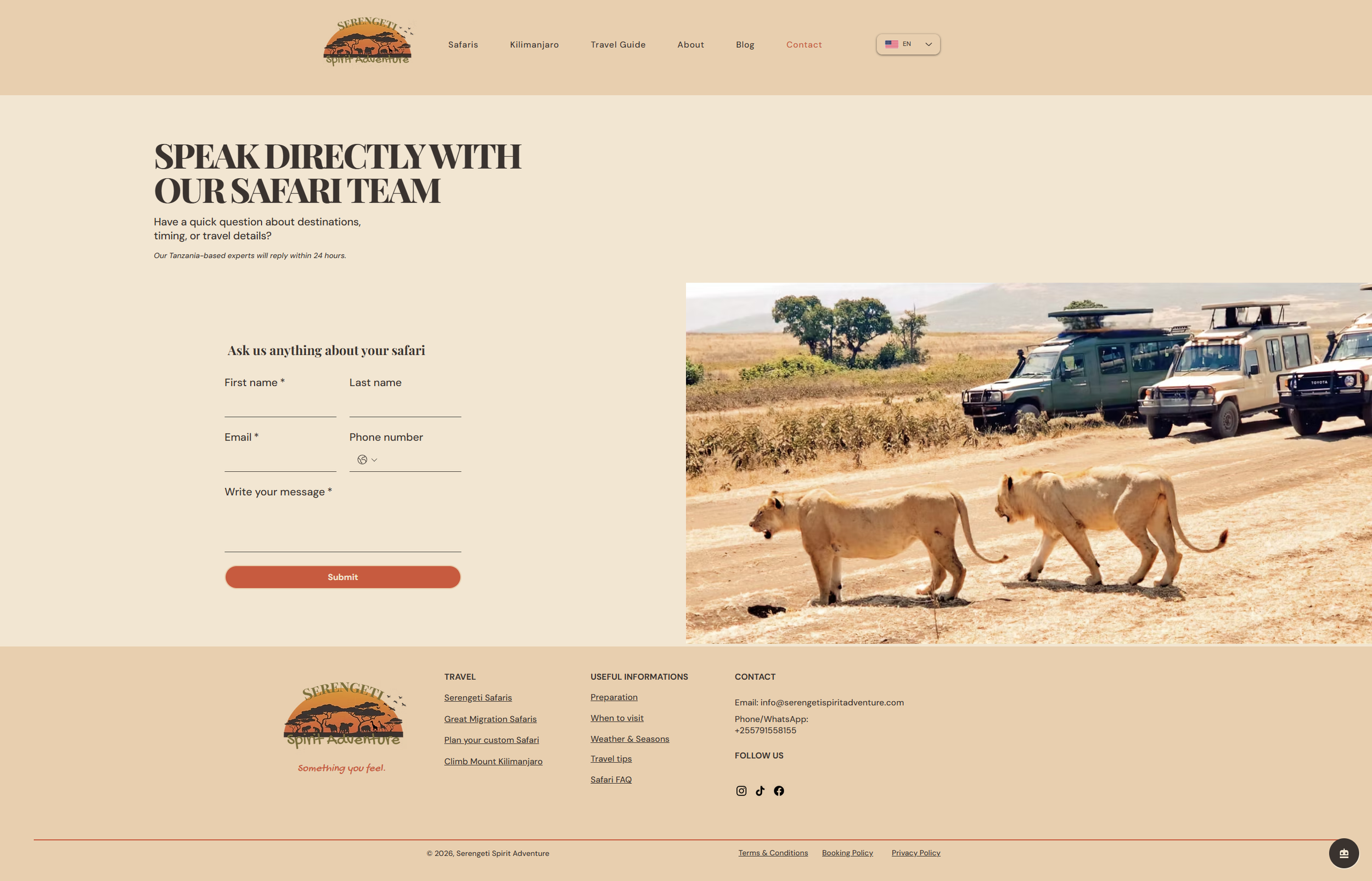
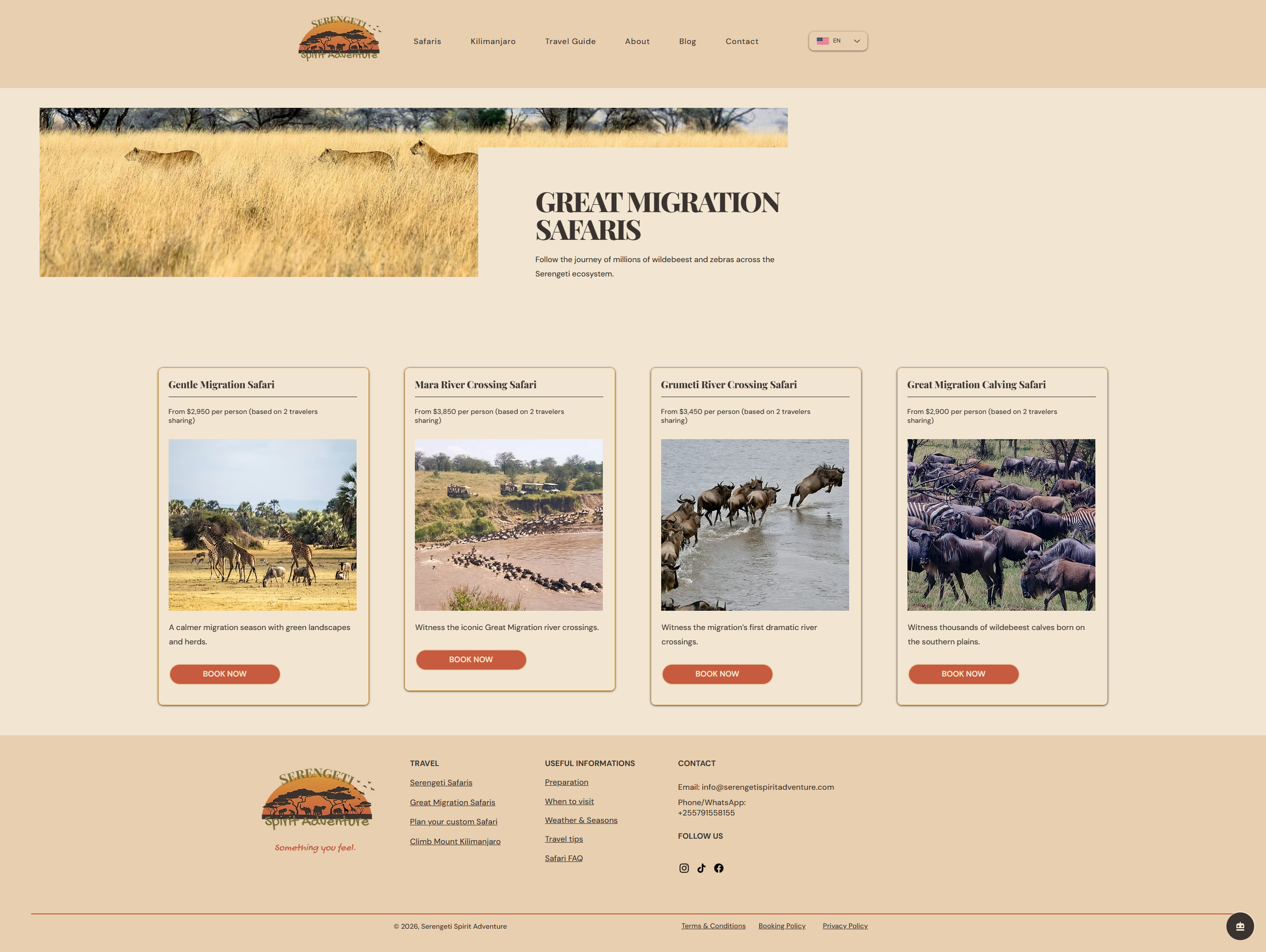
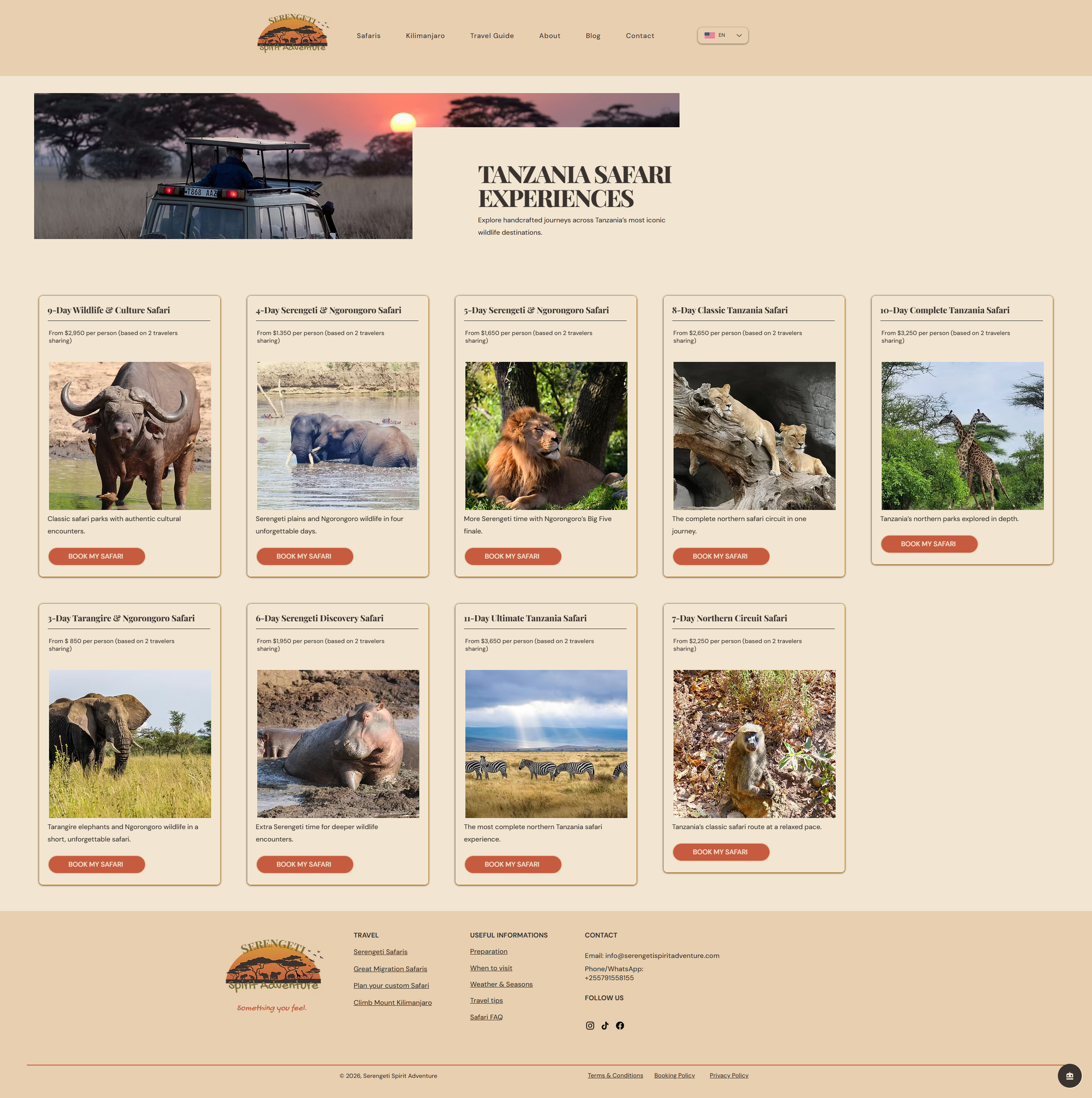
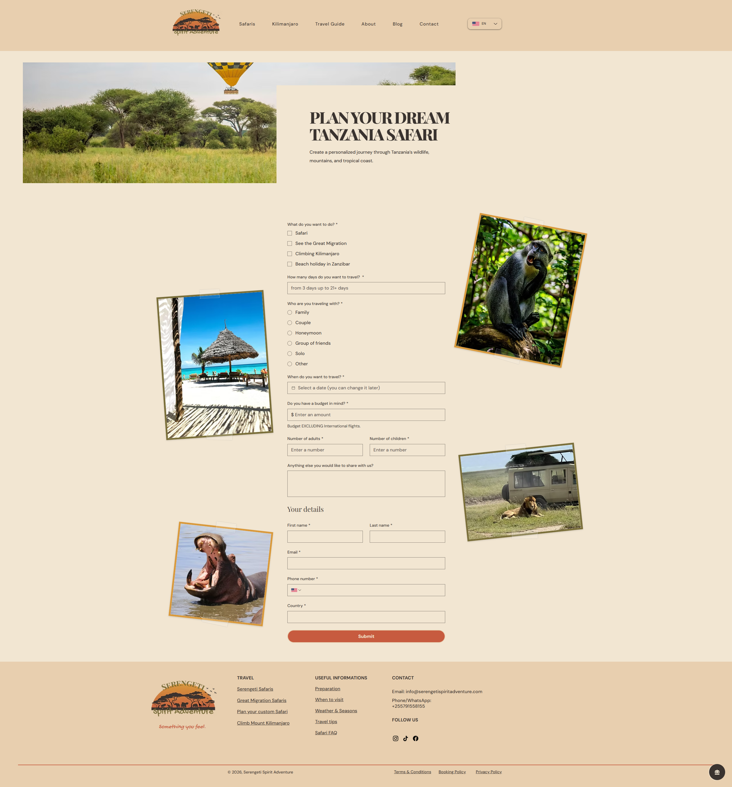
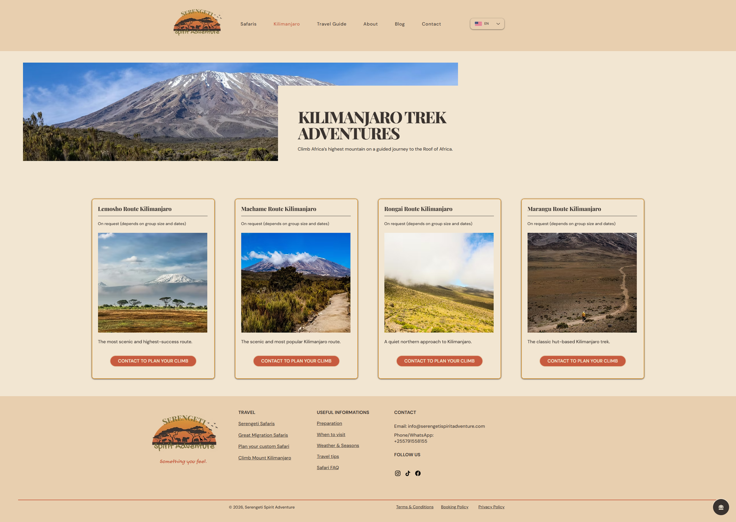
Visual Storytelling: We moved the focus from text-heavy boxes to immersive, high-quality imagery that lets potential travelers "feel" the experience before they book.
The Challenge
Andrea arrived with a website that was functional but lacked authority and visual storytelling. The "before" state featured a generic layout and a logo that struggled to represent the professional depth of a safari expert. My job as the Website Wingwoman was to gently show her what "good" actually looks like and overhaul the entire experience to reflect the quality of her real-world service.
The Design
The design is rooted in the Autumn personality—authentic, textured, and soulful.
Palette: I used an earthy, sunrise-inspired palette: E8CFAF (Warm Sand) for backgrounds, D9993B (Golden Ochre) for section depth, and C75B3F (Terracotta) as the strategic action color for buttons.
Typography: We paired the sophisticated Playfair Display for high-impact headlines with DM Sans for clean, readable body text. I added Gochi Hand as an accent font to inject a handwritten, personal "adventure" feel.
Layout: The new design utilizes generous line spacing, clear sections, and photo-led storytelling to guide the user naturally from "dreaming" to "booking".
The Result
What started as a request for small edits ended as a complete brand overhaul. Andrea now has a website that finally makes her look as professional online as she is in the field. Despite significantly undercharging for this first major redesign, it stands as one of the most satisfying transformations in my portfolio.
Design
Home page
About page
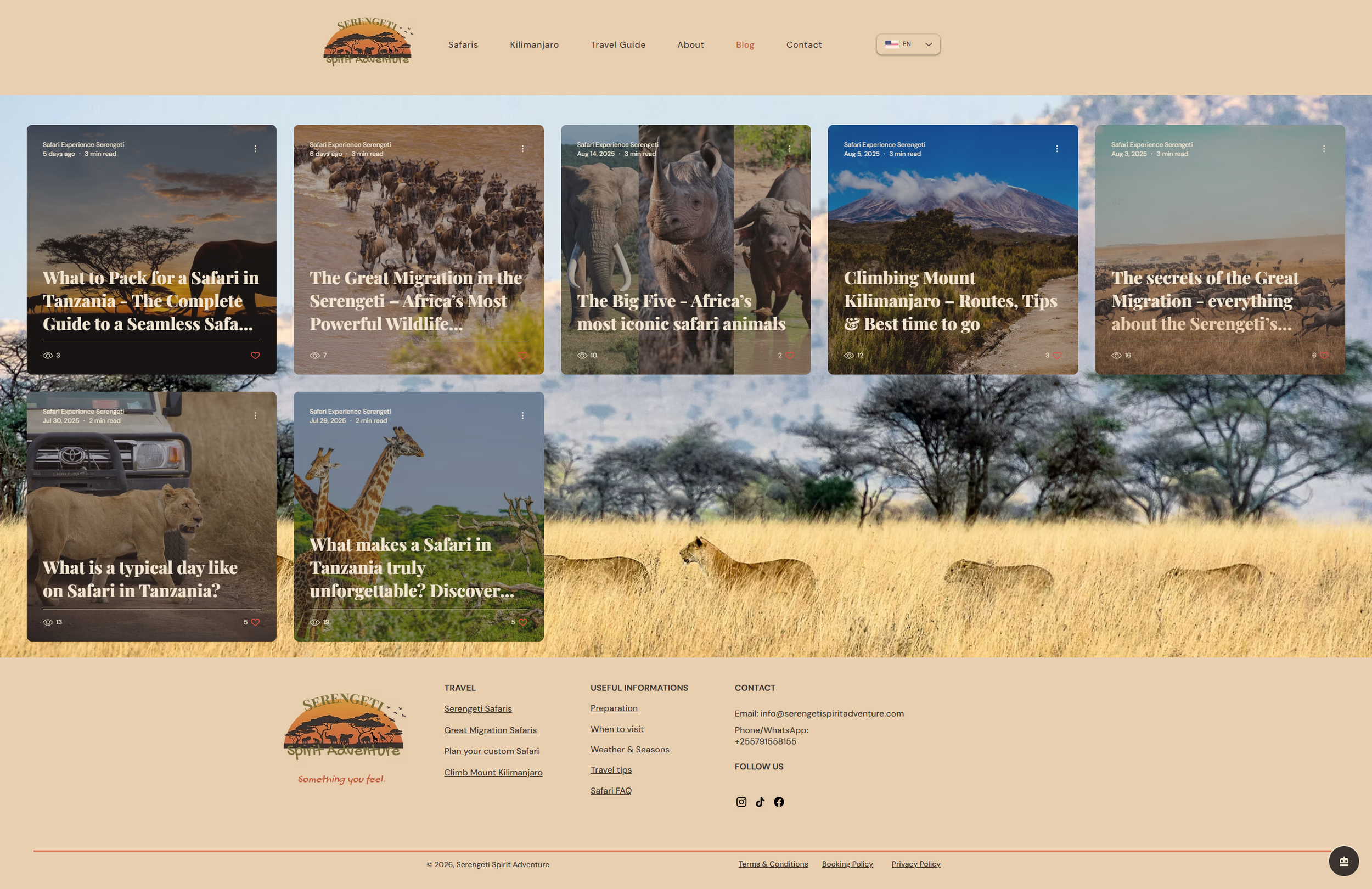
Blog page
Contact page
Services page
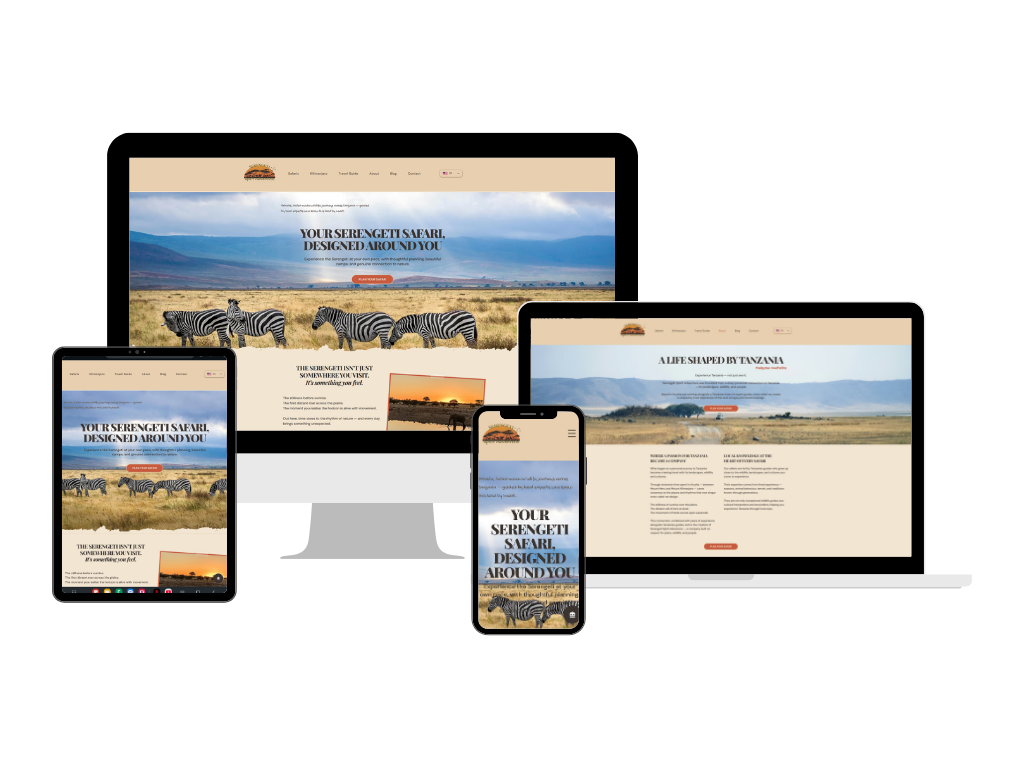
Responsive design
Want a custom website that feels like you?
Let’s create something beautiful together.